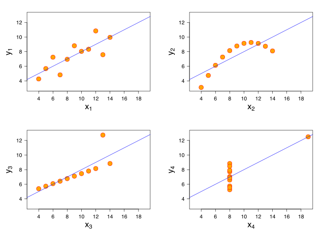
Anscombe's quartet
Stat nuts know this one. It’s an example of the problem with measures for central tendency: you probably are missing things. What distribution has the following:
- The average x value is 9 for each dataset
- The average y value is 7.50 for each dataset
- The variance for x is 11 and the variance for y is 4.12
- The correlation between x and y is 0.816 for each dataset
- A linear regression (line of best fit) for each dataset follows the equation y = 0.5x + 3
All of these distributions!
Even with a set of number summarizing the data, can we still be talking about vastly different distributions. It’s one of those things that always bothers me about ‘average’ income. Basically ‘average’ anything: you may as well spare me the average and hand over your data. It’s often a meaningless number, and I can’t tell if it’s meaningful unless I see the distribution. For instance, how does the income distribution evolve over time? Much more interesting than the average, if you ask me.
Francis Anscombe wanted to demonstrate why we need to graph our data, and he couldn’t have made his point better.